Maps and the World’s Population
Some interesting maps…
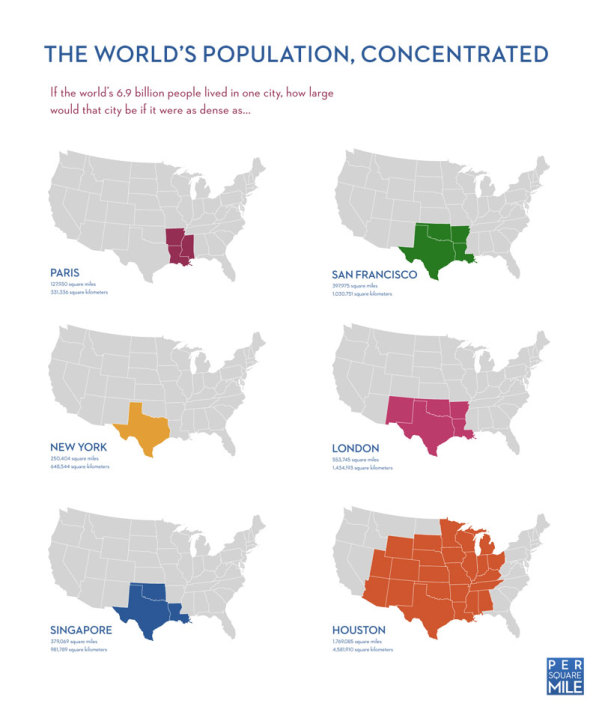
First one, considering the world’s population in a concentrated area…if the world lived in one city.
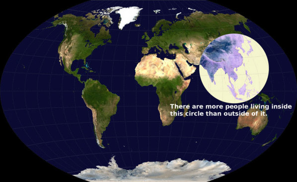
And just where are most of the people located? The world has roughly 7 billion people, and each color on this map represents a part of the world where 1 billion people reside. Red and orange, which contain China and India, are pretty tightly packed!
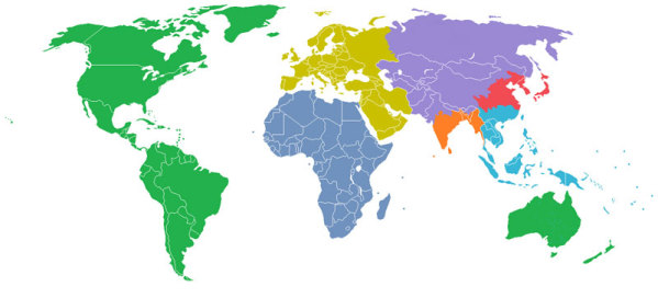
Another map that shows the population density:
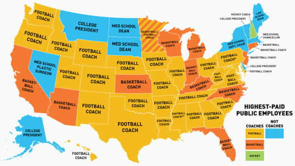
Next map…This is a map of the highest paid public employees by state. I should have been a sports coach?
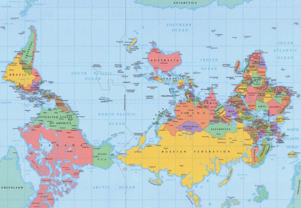
Maybe Australia IS the center of the world? All depends on your perspective and how you draw the map!
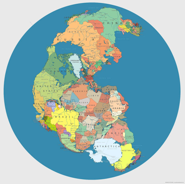
Maybe if the continents had never separated, John and I would have an easier time getting together?
These and more interesting maps can be found HERE
30 Maps That Will Blow Your Mind


